
Guest post from Yineng Zhu, Andrew Permain and Joe Searle, MA Museum Studies students working with the Archives & Special Collections team.
Yineng
Hello, I’m Yineng Zhu. Over the last two weeks, I edited the Library history timeline to make it more specific and convincing. I also scanned some photographs and documents for the timeline stories. There are some interesting events and photographs that I discovered in the progress:
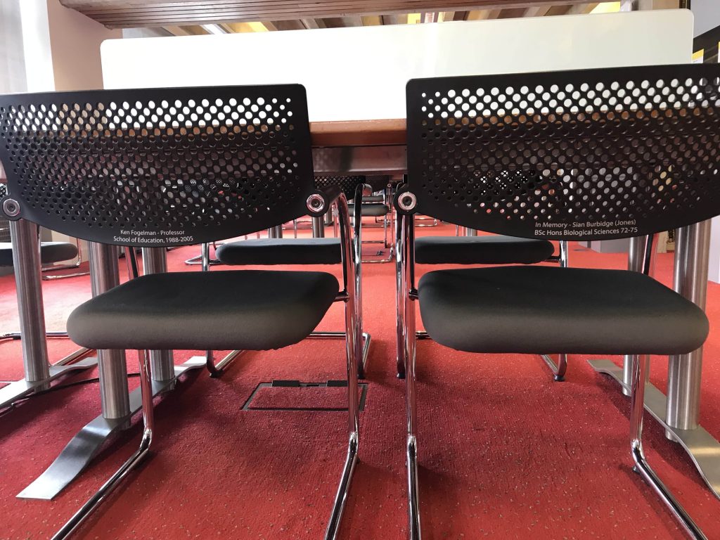
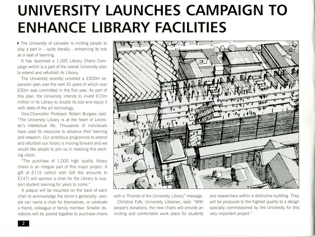
From February to March in 2004, the University launched a 1000 Library Chairs Campaign to enhance the Library facilities. Plaques were mounted on the back of each chair to acknowledge the donor’s generosity. People can name a chair for themselves, or celebrate a friend, colleague or family member. Some of these chairs are still in use on floor 3 of the David Wilson Library.
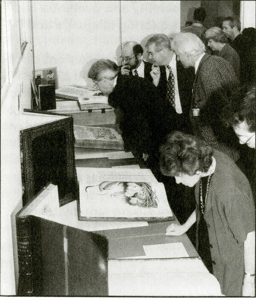
Another interesting find is about the opening of the reorganised rare book room in November 1996. This event coincided with the 21st anniversary of the Library building. This area included a storage room for the thousands of volumes of rare and valuable additions plus an office and a reading room. The photograph shows that some of the earliest visitors in the rare book room.
Now I set out to prepare the physical exhibition at a very early stage. One of the exhibition topics that I chose is about the University’s first librarian, Rhoda Bennett. I collected some archival materials, such as photographs, audio files and newspaper cuttings about Rhoda Bennett. Some of the materials are about her family, and others are the records of her work in the University Library. And at the next stage, I will begin to write labels for the exhibition. Besides, another aspect I need to consider is deciding what to display. Overall, in the following weeks, I will mainly focus on exhibition preparation and installation.
Andrew
Since I last wrote, it has been 2 weeks. These two weeks have been very different form each other. Last week I was away from the research doing as the University motto is Ut vitam habeant ‘so that they may have life’. Rather than being involved in activities relating to the First World War I was participating in events for the Second World War portraying a member of the 2nd Ox and Bucks who were the first troops to land in Normandy on D-Day their actions are immortalised in the film the longest day. This week I have returned to my research on the Fielding Johnson Building and how it has changed during its history. After spending much time looking through the University’s archives I have moved onto seeing what is held by the Record Office for Leicester, Leicestershire & Rutland. During my visits there I attempted to find plans for the building when it was an asylum, however I had no luck with this. Whilst I was there, I came across the annual reports for the asylum and I have begun working my way through them in order to see if I can find out anything new and to double check, what I have already found. Whilst I was there, I discovered a map showing the layout for some trenches in Oadby during WWI.
Joe
Last week I began learning how to use IntuiFace and developed several working prototypes to try out different ideas. This week I took one of these ideas, the Interactive Map of Leicester, and developed it further by adding data from the rest of the Vanished Leicester collection.
Importing the Data
As noted in my previous blog post, I am able to make use of data from the ‘Vanished Leicester’ collection, which contains various images of houses around Leicester with GPS data gathered from historic maps. Simon helpfully gave me access to the full data set, which contains 625 records. One of the most useful features of IntuiFace is that it is able to access data from an external source – such as an Excel spreadsheet – which makes inserting large amounts of data into an experience considerably easier. However, I first needed to modify the spreadsheet to suit my purposes.
On my Interactive Map prototype, I made it so that when a user pressed a marker on a map a popup would appear, which would then display data (such as the name of the house/street, year etc.) alongside the relevant image. The problem I now faced was that I somehow had to access 625 separate images – obviously it was not feasible to download them all – so I had to figure out how to dynamically display the correct image. I could point IntuiFace to a URL of course, but the problem lay with accessing the images which were hosted on CONTENTdm – the digital collections management system that powers Special Collections Online. Fortunately, Simon provided a helpful clue by directing me to the CONTENTdm API, which gave me a way of requesting the images I needed. Thanks to some Excel magic, I managed to quickly build the rest of the spreadsheet and point IntuiFace to the right images for the right records. However, I did encounter a problem with some images that failed to load. I noticed that all of these images were postcards and were recognised in CONTENTdm as Compound Objects – objects with more than one image (for the obverse and reverse sides). I eventually realised that the issue lay with the CONTENTdm id number for Compound Objects, and through some trial-and-error, I found the correct ids for the 3 postcards in the Vanished Leicester collection and managed to display the correct images.
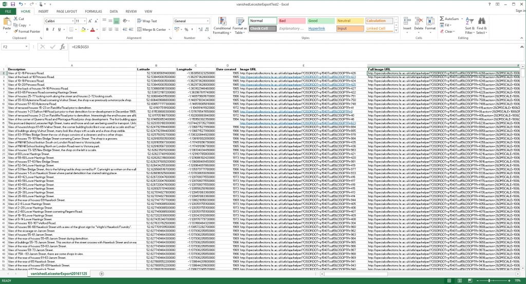 Figure 1: Part of the Full Spreadsheet with the ‘Vanished Leicester’ Data
After this, another issue was revealed when I noticed that the marker for a postcard depicting Leicester High Street was somehow located near Evington Village Green (nearly 3 miles from its actual location). After some confusion, it soon became apparent that the GPS data for some of the records were incorrect, leaving me to conclude that Simon had given me a data set that was perhaps slightly out-of-date (considering that this map has the correct positions).
Loading… Please Wait
My experience with IntuiFace had been excellent so far but some problems had started to emerge. For example, IntuiFace loads all of its data whilst editing in the Composer – not a problem when working with a few images – but this becomes a serious issue when it constantly loads 625 separate markers on a map. The program would sometimes hang for up to a minute, especially when making changes to the map itself or the marker template. I solved this problem by reducing the spreadsheet to only 10 records when editing – only substituting this for the full data set near the end. This also meant that there was always a significant delay when starting the experience before the map became usable. I managed to work around this by creating a ‘loading screen’ that would entertain users for about 30 seconds, by which time all the markers had usually loaded in.
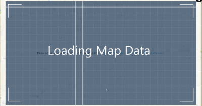
Figure 2: Initial Loading Screen with Animation
Testing in the Digital Reading Room
Now that I had a mature prototype (albeit with placeholder graphics) it was time to test the content I had made on the technology in the Digital Reading Room. It is important to frequently test content on these devices in order to see how they perform – for although I am working on a touch-enabled PC – the content certainly looks very different when running on both on the Wall and Table.
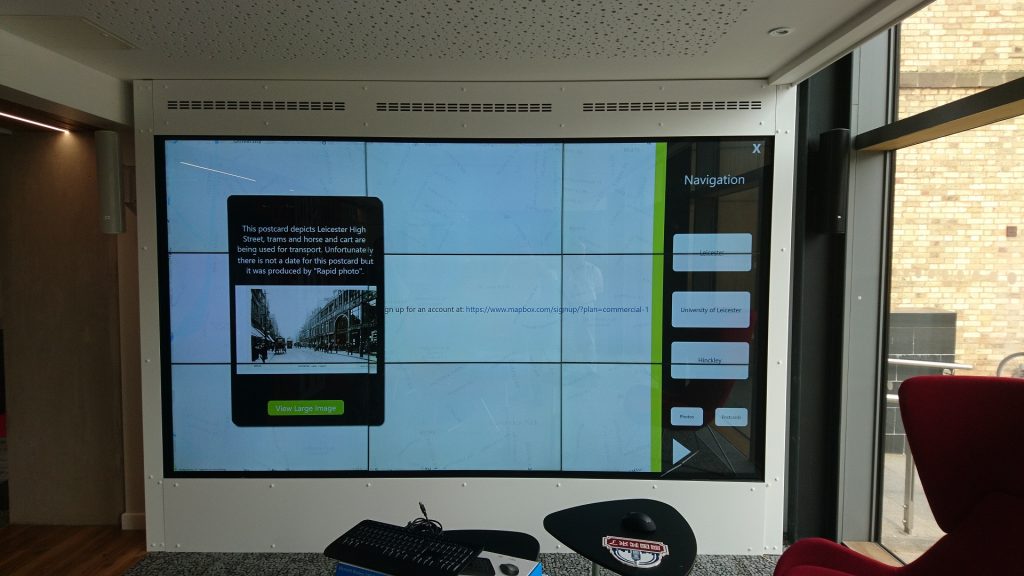 Figure 3: The Interactive Map Prototype Running on the Interactive Wall
It soon became obvious that I would need to spend some time redesigning my experience to better suit the Interactive Wall. In particular, I had not considered the 3×3 grid of screens that make up the Wall and what effect this would have on the elements that ran across it. In addition, I would also need to rethink the placement of interactive elements – since the Wall is very large – it becomes somewhat difficult when standing in front of it to reach certain areas. It was also quite startling to see the difference in scale between the content running on my computer monitor versus the Wall – though I did create a test image to see how different sized content looks, which should help me in the future.
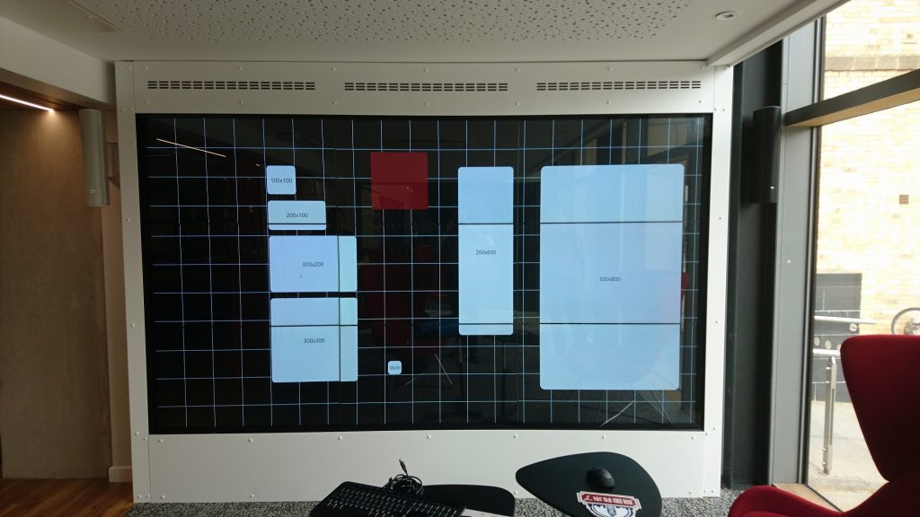 Figure 4: The First Test Image
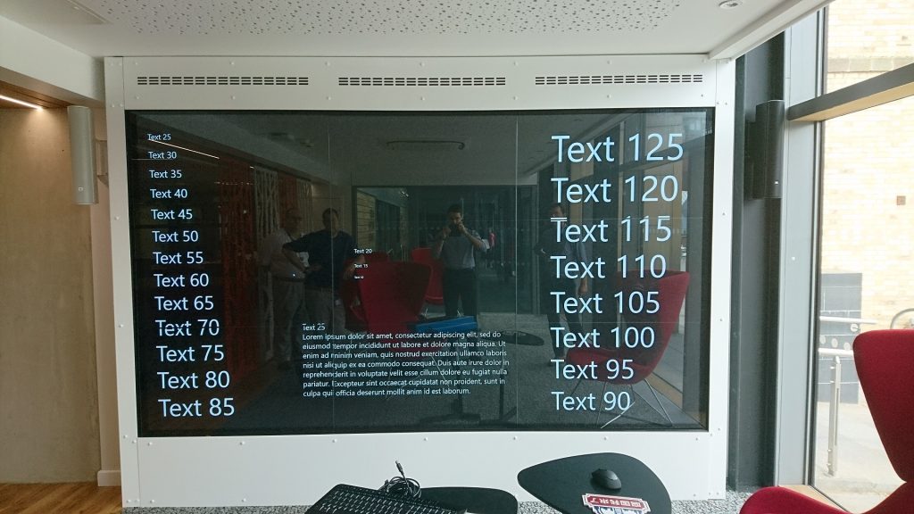 Figure 5: The Second Test Image
The Interactive Map fared better on the Table, and navigating the experience felt far more natural when compared to the Wall. It is interesting to note that when designing this experience I only had a single user in mind – since multiple users would essentially vie for control of the map’s viewport unless they chose to co-operate. Seeing the map running on the Table however, did get me thinking about possible ways to incorporate multiple users – though it is not obvious how to solve the problem of control.
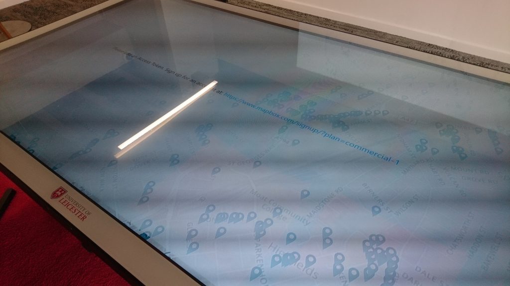 Figure 6: The Interactive Map Prototype Running on the Interactive Table
Finally, I also devoted some time towards creating some before/after images using the ‘Vanished Leicester’ collection. It was surprisingly difficult to find a suitable image, since large areas of Leicester were demolished and are therefore unrecognisable today, though I eventually found a postcard depicting Granby Street (unfortunately with no certain date) that was suitable. Using an image taken from Google Street View, I managed to align both images to create an almost seamless transition between past and present.
Figure 7: Before/After Image Transition of Granby Street, Leicester
By this point I had reached the end of my third week and felt that I had made some good progress. Alongside simply learning more about IntuiFace, I had also reacquainted myself with Microsoft Excel and learnt more about how CONTENTdm works. During the testing, I was surprised by how well my content ran on both the Wall and the Table – since I was unsure of how well these devices would cope with loading the large number of images. At the moment, it seems like the Interactive Map is a viable prototype, but several obstacles still stand in the way before it can find a place in the Digital Reading Room. First, the design may have to be tweaked to take into account the ergonomics of both the Wall and the Table. Second, more time could be spent on polishing the experience to make it look more professional. And third, we would have to obtain a key to use the map within IntuiFace (either Mapbox or Bing Maps) without the onscreen notification – which would require payment. However, even if this work does not ultimately go live, I feel that it has been a useful demonstration of one possible way to present our online collection on the technology in the Digital Reading Room.
 Subscribe to Sarah Wood's posts
What fantastic work!
Not only am I so excited to see our Digital Reading Room being taken through its paces (and its potential explored), but I’m thrilled – and proud – to see it is a group of our students that are doing it.
Can’t wait to read more Yineng, Andrew and Joe about what else you achieve, explore and produce in the next month of your placement in the David Wilson Library.