
This blog discusses the teaching of data analysis with R. It was inspired by a short course that I first ran in the autumn of 2018. The notes for that course can be found at https://github.com/thompson575/RCourse. If you have not already done so then you might start by reading my introduction to the blog at https://staffblogs.le.ac.uk/teachingr/2020/08/24/teaching-r/.
In this post I discuss the workflow that I use in the demonstrations.
When I was taught statistics, nobody would have dared use the word “workflow” for fear of being laughed at. The organisation of one’s work was not discussed, because it was thought to be common-sense and a matter of personal style. Fortunately, those days are over. Under pressure from data scientists, it is now much more acceptable for statisticians to talk about workflows. Over the years, my own work has become increasingly structured and I start my short course in data analysis with R by presenting a simplified version of my workflow and explaining how it will be used in the demonstrations and exercises.
For the students, I motivate the importance of structure through the idea of error control. The argument is that data analysis is complex and so is coding in R, as a result, errors are inevitable. I stress that what is important is not whether you make mistakes, but rather how quickly you notice them. A structured approach to data analysis helps minimise the errors and it makes them easier to spot.
Although I do not say this to the students, my feeling is that structured data analysis has a secondary advantage in that it helps the students to learn R. People pick up complex ideas much more quickly when those ideas are placed within a context or a framework. Once the students have the overall picture of a data analysis, they find it easier to flip between seemingly unrelated ideas. So you can go from readr functions to rmarkdown functions in the same lecture and know that the students will see how each fits within the workflow.
When Hadley Wickham describes the logic behind the tidyverse, he often uses a diagram to explain how a data analysis can be divided into a series of tasks each with its own tidyverse packages (e.g. https://r4ds.had.co.nz/explore-intro.html). Here is a version of Hadley’s workflow
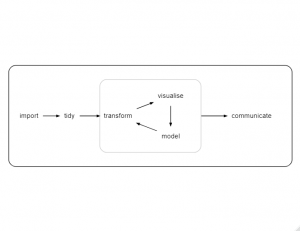
The terminology, as so often with the tidyverse, is slightly unusual but the structure is still useful. We import the data, reorganise it into a form suitable for analysis (tidy), then we iterate around a loop in which we pre-process the data to select important variables or to create derived variables (transform), plot the data (visualise) and build models. When we are happy with the analysis, we prepare a report of our findings (communicate). The diagram explains the structure of the tidyverse and it serves as a good starting point for thinking about data analysis in general.
My own work as a biostatistician requires a slightly different workflow, as shown in the next diagram.
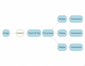
The key points of difference are that
- Study design is added as an important feature of data analysis
- Pre-processing is completed before you start the analysis
- One study might involve many analyses of the same data, represented by the three shown here
Perhaps there should be an extra box in my diagram for “clarifying the research questions”. When a statistician acts as a statistical consultant, it is not at all unusual to spend the first session talking through the aims of the research and trying to turn those aims into specific questions that can be answered with the data that are, or will be, available. It is not always the case, but this discussion ought to take place prior to data collection, so I think of “clarifying the research questions” as part of the design.
Design
Statisticians have an important role in study design and both experimental design and survey design have their own specialist statistical literature. Statisticians help with questions of sample size, power, randomization, measurement error and so on.
In contrast, data scientists rarely have the luxury of being involved in the design because they usually analyse large datasets collected for other purposes. So it could be argued that design is less important in data science, but I think that this would be a mistake for two reasons; data scientists may not be able to change the design, but they still need to understand it and in large studies, they have the option to sample rather than analyse the whole dataset.
As an example, imagine a study that analyses hourly air pollution measurements collected over the last year by monitors placed at numerous points across a city.
Tempting as it is, I must be careful not to caricature data scientists, but it is not too much of an exaggeration to suggest that many would start by tidying the data and preparing some exploratory visualisations. I’d argue that a more appropriate first step would be to ask a series of questions about the design
- What questions are we trying to answer?
- How were the monitoring sites chosen?
- Who chose the pollutants that would be measured and why?
- Do the hourly measurements represent a point in time or the average level over that hour?
- Are the monitors all of the same type? Are some more accurate than others?
- Are the readings affected by the heights of the monitors above the ground or whether they are protected from the prevailing wind?
- There will inevitably be some missing data. Perhaps, one of the monitors was out of action for the whole of September. Why was that? Did the monitor breakdown or was it switched off?
- … and so on
Unless the data analyst asks these questions, they run a real risk of making poor decisions about the form of the analysis.
With very large data sets, precision is usually much less of a problem than bias. So having understood the way that the data were collected, the analyst should next consider whether to analyse all of the data or to concentrate on a sample. Here are three examples of situations in which sampling might be appropriate.
- Data scientists take pride in their ability to handle extremely large data sets, but what if the research questions can be answered adequately with a 10% random sample of the data, why not sample?
- In some situations a matched sample will simplify the analysis. Suppose that 1% of a large cohort have a condition that interests you. Rather than compare them with the remaining 99%, it might be better to compare with a smaller sample matched by age and sex.
- What if the data were obtained from different sources and one source is known to be much less reliable than the others. Perhaps a less biased analysis would be obtained by omitting the unreliable source.
Another, quite different, aspect of design that is important to statisticians is the design of the analysis. In a clinical trial it is usual for the statisticians to prepare a statistical analysis plan (SAP) in advance of the data collection. The idea is to avoid the situation in which the researchers try many different analyses and then report the one that is most favourable to their preferred theory. A SAP helps focus the research questions and limits the tendency to engage in the type of research that says, we have these data, let’s see what we can find.
In my opinion, data scientists tend to underestimate the importance of subjectivity in data analysis.
Tidying and Pre-processing
I have kept the data tidying step in my workflow diagram and freely acknowledge that the organisation of the data prior to analysis is a vital skill that is neglected in many statistics courses. On my short course, I make a lot of use of the ideas in Hadley Wickham’s paper on tidy data (https://www.jstatsoft.org/article/view/v059i10 ). In essence, this approach stores the data in tables much as one would in a relational database. Since the paper is very clear, I’ll leave it there and move on to next stage in the workflow, the pre-processing.
Pre-processing is represented in my diagram by a single box but in reality it usually expands into a cycle of three stages, as shown below.
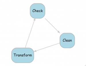
During the pre-processing, we check the data for errors, duplications, inconsistencies, missing values etc. Then we clean the data, by which I mean correct the obvious errors. In the transform stage, we might do anything from simple recoding or categorisation through to complex feature selection, data reduction or multiple imputation. After this, the data will have changed, so we need to check them once again for errors and inconsistencies, cycling until we are happy with the data quality.
A key point is that all of this pre-processing must be completed before the analyses are started. If not, there is a real danger that two analyses, or even two parts of the same analysis, will be based on subtly different versions of the same data.
Analysis
Just like the pre-processing, the analysis step can be expanded into a cycle with three stages, as shown in the next diagram.
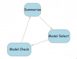
The first stage involves summarising to produce a basic description of the processed data. The summaries together with the research questions will probably suggest models, so we move on to model selection. Typically, this will require several models to be fitted with some criterion, or performance metric, used to choose between them. Next comes model checking to ensure that the assumptions of the chosen model are satisfied and that the model is sufficient to answer whatever questions we started with. We might continue around the cycle by summarising the results of the model fit and perhaps this will suggest new models that we can fit and check.
Within this cycle, data scientists usually avoid over-fitting by dividing the data into training, validation and test sets, or training and tests sets if they plan to use cross-validation. Statisticians rarely reserve data for testing, so it is interesting to ask why.
Until recently, statisticians have tended to work on small or moderate sized data sets, so that the loss of precision that would result from data splitting would have had a major impact on the analyses. Secondly, statisticians tend to use simple models, perhaps assuming linearity and lack of interaction, and as a result, over-fitting is not a major problem and typically, these simple models are compared using formal model selection methods, such as the AIC, that penalise model complexity.
In biostatistics, it is certainly the case that replication in a second, independent dataset is considered important. Here the second sample is used differently and acts as an indicator of whether or not the findings will generalise. When a single data set is randomly split, the many small biases present in the training data are also present in the test data, therefore performance in the test data gives no information about generalisability.
You will probably have noticed that visualisation does not feature in my workflow. For me, visualisation is just a tool that I might use at any stage of the analysis. For example, visualisation can help with data checking, or with the data summary, or as part of model checking. It is not an end in itself.
Simplifying the workflow
My workflow diagram helps me to think about the process of data analysis but for the purpose of teaching, a simpler picture is likely to be more helpful. My diagram represents the place that I would like the students to reach, but it does not follow that it should be presented to them at the very beginning. The examples in my introductory course can be tackled with a much simpler workflow and students who have a limited experience of data analysis can be baffled by the inclusion of seemingly redundant stages. Here is a simpler picture that works for one of the early examples in the course.
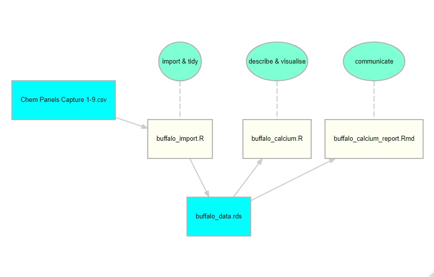
This workflow relates to a study of serum calcium levels in African buffalo and in this diagram I show the stages in the analysis in aquamarine, the R scripts in ivory and the data files in cyan. This is what I present to the students.
When I first ran this short course, I did not include this type of diagram. I talked in general terms about workflow, but thought that a diagram was unnecessary. I was wrong. Many of my students had never before seen a data analysis broken down into stages. For them, an analysis was all one thing made up of reading data, recoding, model fitting or whatever. So when I had separate scripts for data import and data analysis, or when I saved the tidy data before analysing it, a sizeable minority of them got confused. The second time that I taught the course, I included the diagram and I had no such problems.
There are many other aspects of structured working, such as how we organise the project folders, how we name files, how we document, how we archive and so on. I will cover these topics in future posts.
 Subscribe to John's posts
Recent Comments